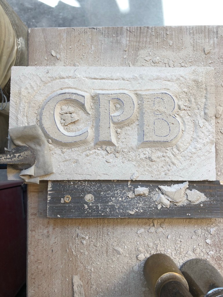
Raised Lettering, w. John Neilson
For the more elaborate piece, we must think of two words, I will be carving ‘wedi blino’ (welsh for tired). John spoke in detail about how to make letters more dynamic (if they line up, where they lean, large exaggerations etc.). There were a few other things he mentioned but the most important ones would be the type of raised lettering (cushioned, completely cut away, a panel cut in, etc.) and the background texture.
Sadly the letterers I’m drawing hold next to no interest to me. I find the forced dramatisation uninspired, hiding the form behind a ‘different’ medium and method that hides all nuances and subtlety. To an untrained letterer, which we all are. John’s work is phenomenal, but forcing people who don’t understand letters to design in this way doesn’t seem to render good results. But I can see why we are doing it as an exercise.

Leave a comment