Raised Lettering, w. John Nielson
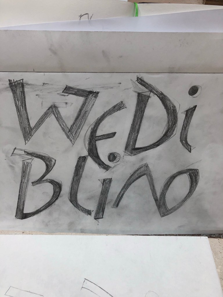
Spoke to John in the morning about the quick design I did last night, he was much happier with it than I expected so after an hour of tweaking I came to my final design which I then scaled up in GIMP before adding the thick’s and thins on by shading.
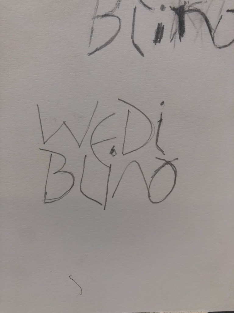
I spent awhile playing around with where to put emphasis and landed on this style, probably due to the amount of Germanic lettering I’ve been looking into.
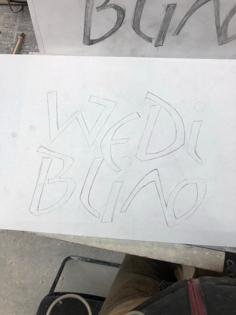
After some tweaking from John and final decisions made when I traced the inscription I was ready to start carving.
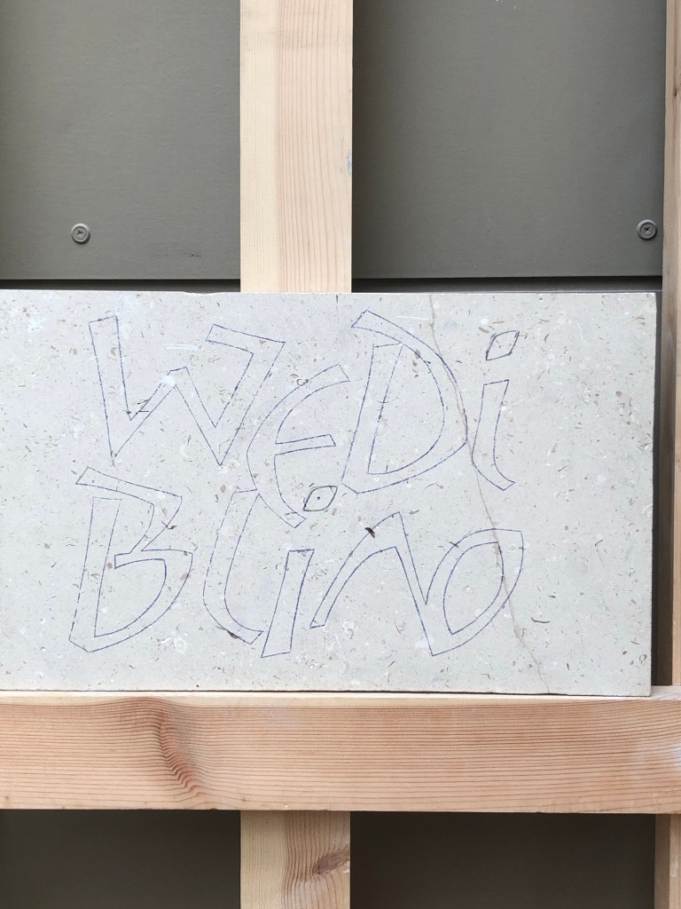
Due to the fact I am cushioning the letters I am going straight to the 63 degree angle so there is no shelf between the letter and where the background drops. This makes it a bit harder to get the depth right so lots of measuring angles and depth as I go, takes longer but no mistakes this way, or inconsistencies.
3rd Year Lettering Prop
I spoke to John briefly about a quick sketch for my third year lettering/carving proposal and he gave some quick tips. I should loose the spaces between letters almost entirely, loose guidelines and always think about how each letter-form relates to the shapes and specs around it (and generally across the inscription).
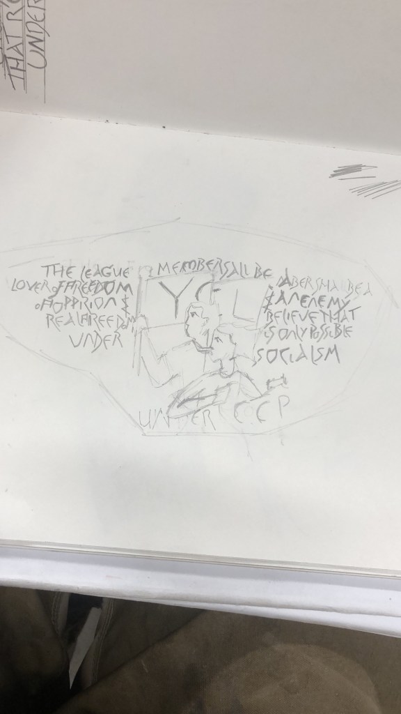
I plan on doing this on a large granite boulder that I’ll get from a quarry in Cornwall, if Emma can get in contact with her mate there.

Leave a comment