Brushed Lettering
Long piece of paper, around five to six feet in my case, with a chalk line marked on at ninety millimetre/three and three quarter inches. This is with a three-eighth’s brush (or ten millimetres). The ‘ink’ we’re using is watered down Gouache, just lighter than single cream. Looking after the brush using gouache only means keeping it wet while on break and making sure it’s not resting on the bristles.
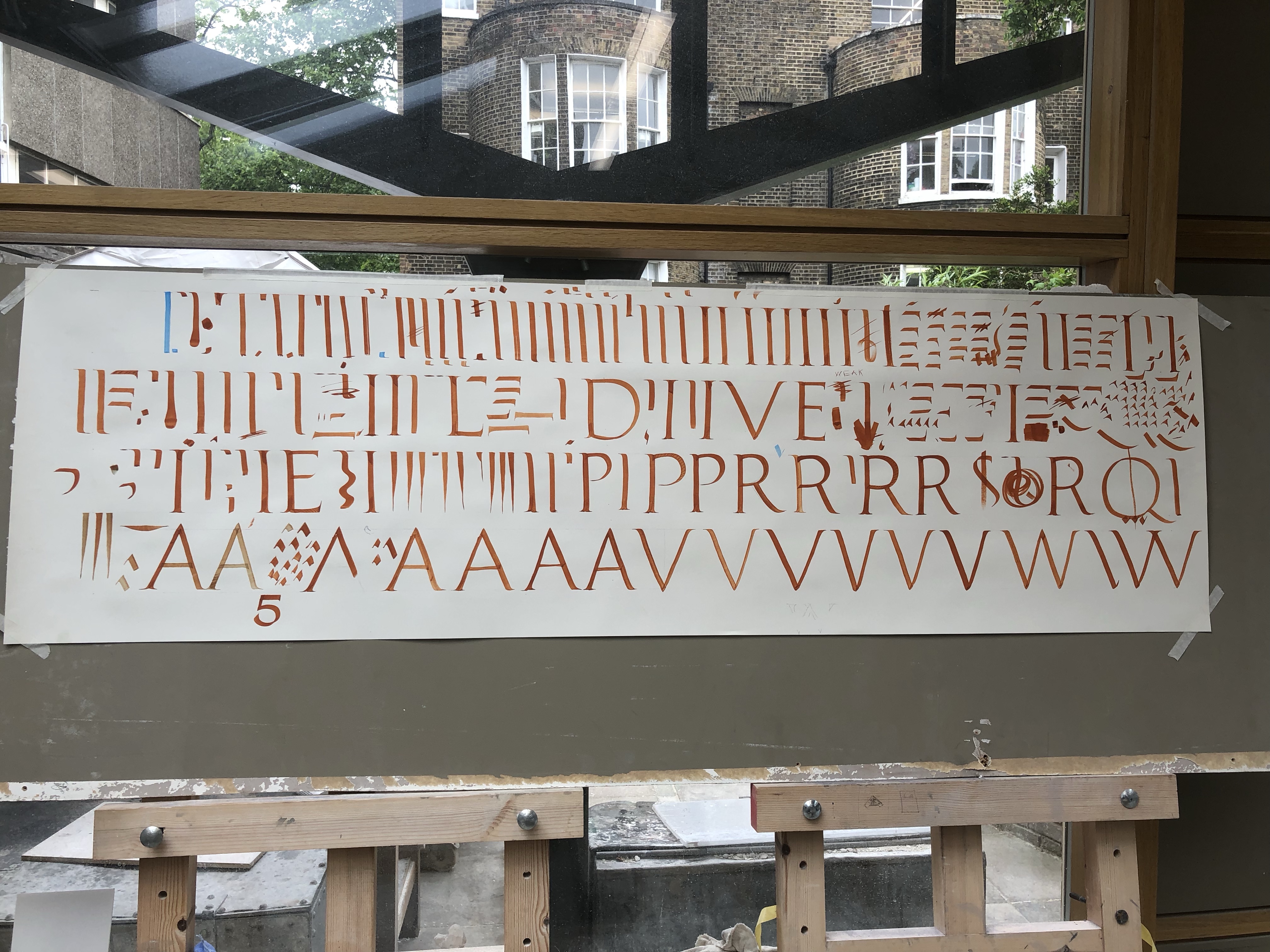
Our first exercise was just a straight stroke, no serif. Lifting brush straight off the paper at the termination. Much harder than finishing with a serif. After this we added the serif and the top left and bottom right, one difference between what I’ve read in Johnston’s book was the first down stroke has no twist. Which took some getting used to.
After some practice on horizontal strokes, with the twist at the termination. Phil have us an exercise on brush control, twisting the brush in three different ways. First keeping both sides of the brush even, then only bringing in the right side, then the left. (See below)

Phil spoke briefly about Trajan proportions but nothing new here.
On painting the O shape, you can use a compass to mark a circle. Then paint just inside the left and right sides, then slightly above at the top and bottom. The strokes also sit on top of one another, so the first on starts below where the second stroke begins.

Leave a comment