Brushed Lettering
Started the day by drawing out a skeleton alphabet, to help guide my brush strokes, and also practice my proportions. By first break I had finished my first alphabet.
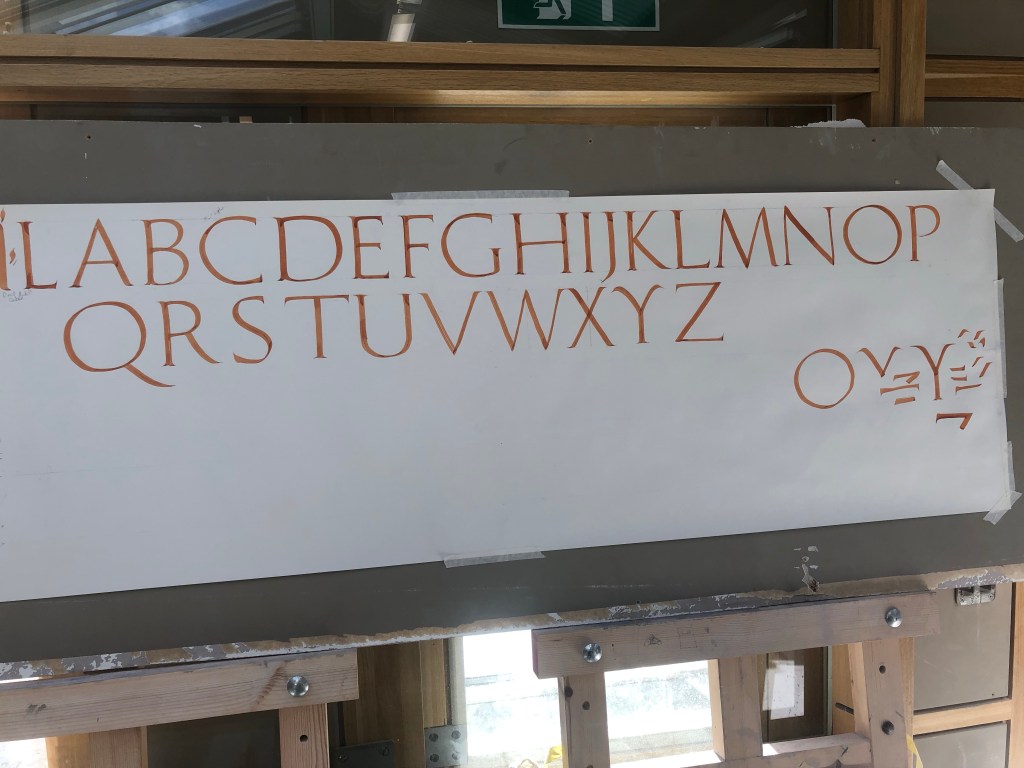
After going through this alphabet with Phil, we found several things I should watch. Most notably my thins were far too thin. Making the letters weak and spindly, so focused on this on the next attempt.
Phil also went over ‘Rustic‘ alphabets, found in Pompeii, explaining their origin in informal advertising and fast lettering. These forms are much more compressed than Trajan, and the brush is much more free to flow. Phil said to move quickly and see how your hand paints naturally.
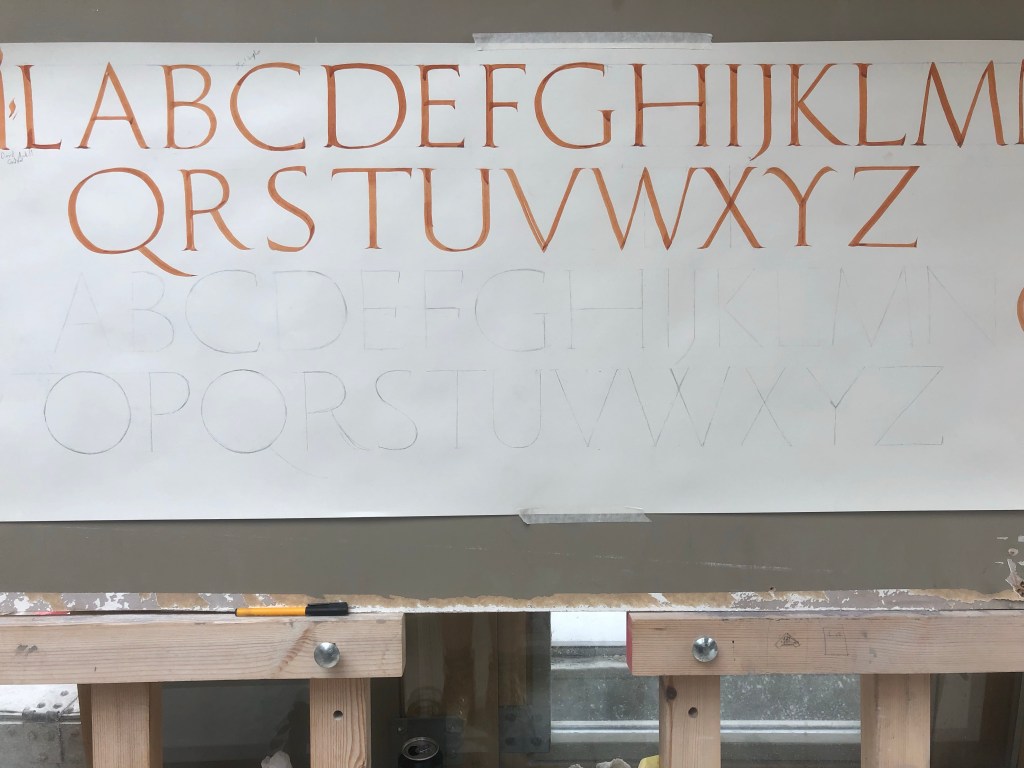
After this talk we had a look at the last skeleton alphabet I did and corrected mistakes (such as, the ‘H’ was too wide, the “R’s” top shape needed more of an angle and the “E’s” bottom width was a hair’s breath wide).


Leave a comment